• Skip to primary navigation
  • Skip to main content
  • Skip to primary sidebar

5 Circles Research

  • Overview
  • SurveysAlaCarte
  • Full Service
  • About
  • Pricing Gurus
  • Events
  • Blog
  • Contact

Statistics

Leave a Comment

Valentine’s Day: think about seasonality and annual trends

Valentine’s Day provides an opportunity for me to suggest that your market research should take into account some bigger picture factors. Whether or not you have a retail product or service, there are lessons to be learned from Valentine’s Day. What are the annual seasonal variations in your business and what are the trends over longer periods? How do trends affect your market research?

256px-Chocolate_gift GVBORI_Diamond_ring_Heart_desgin256 RED_ROSES_4_(2791762442)

Valentine’s Day is well known as the second most important gift giving occasion in the calendar, in the US certainly and for most of the Western world also. But that’s too simplistic. Let’s look at trends of 3 important gift categories. I’m using Google trends to look at search volumes, as an easy way to make a couple of points.

[trends h=”330″ w=”500″ q=”flowers,+chocolate,+jewelry” geo=”US” date=”1/2008+73m”]
The Y axis is the volume of searches, and the X axis is time. We’re concentrating on searching here. [Data from various sources including the National Retail Federation show that flowers are given as gifts about twice as often as jewelry, and candy is more frequently given than flowers.]

Note that Christmas is more important than Valentine’s Day for searches on chocolate. And the same is true of jewelry. Flowers are rarely searched at Christmas, more frequently at Valentine’s Day, but most often for Mother’s Day. Note that these charts are all for the US so the added complexity of different dates for Mother’s Day in different countries has been eliminated.

OK so this is about chocolate, jewelry and flowers – what does it mean for your product or service? Imagine that you are planning a research project to find out which items you should carry in a multiline store. Or that you want to know which services will be most popular. Your results might be thrown off if you conducted the research without factoring in seasonality. Valentine’s Day, and gift giving in general are pretty obvious. So are back to school, outdoor recreation, and many other time-driven factors that might affect your business and your research. What about B2B? You probably need to be aware of budgetary cycles and replacement planning. The point is awareness. Once you know that the factors exist, you can decide if you should adjust research timing (this is rarely realistic), or if you need to modify the survey in other ways such as identifying buying cycles or interest levels in the category, including adjusting the sampling approach. For example, if you’ve just purchased a new car you are more likely to give coherent answers about after-market accessories.

Longer-term trends are a little harder to see from the Google Trends chart because of the big swings each year. But it is clear that the search volume for chocolate has increased over the past few years.

Back to Valentine’s Day. Much of the published research covers expected spending and plans. I’m a planner, so I’m usually ready for the holiday. What about those last minute people who haven’t prepared, or if they think about it at all are expecting to buy some flowers on Valentine’s Day itself? With the severe weather conditions in the Northeast, these people might be out of luck, and their sweethearts will be disappointed. I hope they can order something online – the acknowledgment and an electronic greetings card might have to do.
512px-Cross_Country_Skiing_Belden_Ave_Chicago_Feb_2_2011

Idiosyncratically,

Mike Pritchard


Image sources:

Ring: By GVBORI520 (Own work) [CC-BY-SA-3.0 (http://creativecommons.org/licenses/by-sa/3.0)], via Wikimedia Commons
Chocolate: By Chrys Omori from Sao Paulo, Brazil (Mother’s birthday gift) [CC-BY-2.0 (http://creativecommons.org/licenses/by/2.0)], via Wikimedia Commons
Flowers: By Kaz Andrew from Edmonton,Alberta, Canada (RED ROSES 4 Uploaded by Dolovis) [CC-BY-SA-2.0 (http://creativecommons.org/licenses/by-sa/2.0)], via Wikimedia Commons
Snowy road: Victorgrigas at en.wikipedia [CC0], from Wikimedia Commons

Filed Under: Methodology, Statistics

Leave a Comment

Predicting Olympic Records

An article in the New York Times, “Which Records Get Shattered?“, analyzes the prospects for record-breaking at the 2012 Summer Olympics in London. Nate Silver returns to sports analysis – his old stomping ground before he started the FiveThirtyEight blog which covers election polling.

Phelps4x100 John Nunn wins 50K
Michael Phelps, 4x100m relay, Beijing 2008 Olympics John Nunn winning his place on the US 2012 Olympic team in the 50K racewalk

The last time I commented on a Nate Silver article, he was predicting winners at the Academy Awards. Nate’s performance that time wasn’t good. He was out of his element in an event that often has upsets.

Besides returning to his roots, Nate is playing it safe by not predicting the outcome of specific events. He took the same tack in an article a couple of weeks ago, “Let’s Play MedalBall!” which gave advice to nations aspiring to achieve Olympic medals.

But let’s return to the topic of Olympic records. I liked the analysis in the article, as well as some aspects of the presentation of the results. Silver calculated percentage improvements in performances between the 1968 Olympics (Mexico City) and 2012 (London). To avoid effects of outliers, the statistical approach incorporated all Olympic performances, not just records. I don’t know if there was any correction made for the 7,300 feet altitude in Mexico City, but any effect would have been eliminated over the 40 years of the data. The calculations were based on time for the most part, but distance was used for field events like javelin, discus, and long jump.

The main conclusion of the analysis is that some types of events have exhibited overall greater performance improvements than others; these are the events where records are more likely be broken. In particular, swimming events improved by an average of 10.3% from 1968 to 2008, while track and field events improved by an average of 4.1%. In fact, in track and field performance has actually declined in a couple of events (javelin and shot-put), but as can be seen easily from the chart these are anomalies. Also notable is that the greatest improvements in track and field are for the longer events including racewalking (who knew?)

Silver offers some reasons for the differences, but I don’t know if any formal correlation analyses were done for his independent variables. He suggests that technology has benefited swimming in particular through better costumes and better pools, whereas runners haven’t had any significant tools to help them over the same period. Also, Nate writes, those from poorer nations have less access to swimming pools which means that the group of potential stars was limited as compared to athletics where little equipment is needed. It seems possible to me that these new stars are added to the pool (pun intended) through economic improvements in their own countries as well as some migration; I haven’t analyzed this – it’s just a theory.

Reporting

The article uses a long horizontal bar chart that works well in the broadsheet format of the New York Times. Silver combines male and female (distinguished by bold), and uses color to identify different types of events, arrayed in order of performance improvements.  Nice job!

But how could you convey something similar in a normal style of research report – landscape format PowerPoint, with limited room on the vertical axis?

  • Turning the whole thing on its side isn’t going to work well. The length of the text for the events wouldn’t look good along the X axis, even when the text is angled. And using vertical bars might not convey the differences as well, but in any case there are still too many events for the effects to be properly communicated.
  • I’d use a version of the chart as an inset, as large as possible, and then pull out subsets to show specific points. This would perhaps work even better. Events could be grouped by type and gender, perhaps separating gender within sports. The current chart makes it fairly clear that female swimming has improved more than male, but with the inclusion of some field events in the mix the point is less clear.  Three or four additional smaller charts supporting the main chart should do the trick. And you could hover over the PowerPoint to confirm anything that’s unclear to the people in the back of the room.

Actually the online version of the article uses only a clipped version of the chart as a teaser. The full chart is accessible in a separate browser window.

I hope this post has given you a few ideas about reporting a complex topic.  As for records at the 2012 Olympics, it’s too soon to know if the trends seen in the article will continue, as many of the events with the most improvement haven’t yet been held. There have already been some new records in swimming. Other records include weightlifting and archery, which weren’t covered in the article. Personally, I’d like to see a gold medal or two for my homeland, never mind a record. After the disappointment with synchronized diving, even a win in a lower profile sport might boost Britons’ morale. No predictions from me, but I’ll be keeping an eye out for trampoline and rowing (where Katherine Grainger and Anna Watkins have already broken the Olympic record).

Update August 3rd: Grainger and Watkins succeeded, and Britain is now in 3rd place for medals, behind China and the U.S. (showing the home country boost). There have been quite a few Olympic records broken in swimming, consistent with Nate Silver’s analysis. Most of the other events he analyzed are still under way.

Idiosyncratically,

Mike Pritchard


Image sources:

John Nunn Racewalking: By U.S. Army (Flickr: John Nunn wins 50K) [CC-BY-2.0], via Wikimedia Commons
Michael Phelps: By Jmex60 (Own work) [GFDL or CC-BY-SA-3.0-2.5-2.0-1.0], via Wikimedia Commons

Filed Under: Fun, Published Studies, Reporting, Statistics

Leave a Comment

Why you should run statistical tests

A recent article in the Seattle Times covering a poll by Elway Research gives me an opportunity to discuss statistical testing. The description of the methodology indicates, as I’d expect, that the poll was conducted properly to achieve a representative sample:

About the poll: Telephone interviews were conducted by live, professional interviewers with 405 voters selected at random from registered voters in Washington state June 9-13. Margin of sampling error is ±5% at the 95% level of confidence.

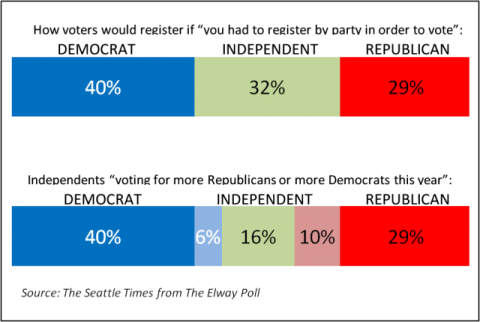
That’s a solid statement. But what struck me was that the commentary, based on the chart I’m reproducing here, might seem inconsistent with the reliability statement above.

Chart of Elway Research Poll Results from Seattle Times

The accompanying text reads “More Washingtonians claim allegiance to Democrats than to Republicans, but independents are tilting more towards the GOP.” How can this be, when the difference is only 4% (6% more Democrats, 10% more Republicans)? The answer lies in how statistical testing works and the fact that statistical tests take into account the differences arising from different event probabilities.

First, let’s dissect the reliability statement. It means that results from this survey will be within ±5% of the true population, registered voters in this case, 19 out of 20 times if samples of this size were drawn from the registered voter list and surveyed. (One time in 20 the results could be outside of that ±5% range; that’s the result of sampling.) This ±5% range is actually the worst case and is only this high at for 50% event probabilities – meaning the situation where responses are likely to be equally split. Researchers use the worst case figure to ensure that they sample enough people for the desired reliability whatever the results are. In this case, the range for Independents leaning towards Democrats is ±2.3% (i.e. 3.7% to 8.3%) while the range for Independents leaning towards the GOP is ±2.9% (i.e. 7.9% to 12.9%). But these ranges overlap so how can the statement about tilting more to the Republicans be made with confidence?

We need to run statistical tests to apply more rigor to the reporting. In this case t-tests or z-tests will show the answer we need. The t-test is perhaps more commonly used because if works with smaller sample sizes, although we have a large enough sample here for either. Applying a t-test to the 6% and 10% results we find that the t-score is 2.02 which is greater than the 1.96 needed for 95% confidence. The differences in proportions are NOT likely due to random chance, and the statement is correct.

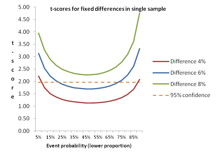
Chart of t-scores for small proportion differences

To illustrate the impact of event probability on statistical testing, this diagram shows how smaller differences in proportions are more able to discriminate differences as the event probability gets further away from the midpoint. Note that even at 6% difference results between about 20% and 70% (for the lower proportion) won’t generate a statistically significant difference, while at 8% difference the event probability doesn’t matter. Actually, 7% is sufficient – just.

Without using statistical testing, you won’t be sure that the survey results you see for small differences really mean that the groups in the surveyed population differ. How can you prioritize your efforts for feature A versus feature B if you don’t know what’s really important? Do your prospects differ in how they find information or make decisions to buy? You can create more solid insights and recommendations if you test.

Tools for statistical testing

The diagram above shows how things work, and is a rule of thumb for one type of testing. But it is generally best to use one or more tools to do significance testing.
Online survey tools don’t generally offer significance testing. The vendors tell me that users can get into trouble, and they don’t want to provide support. So you are need to find your own solutions. If you are doing analysis in Excel you can use t-tests and z-tests that are included in the Data Analysis Toolpak. But these only work on the individual results so if you are trying to look at aggregate proportions (as might be needed when using secondary research as I did above) you need a different tool. Online calculators are available from a number of websites, or you might want to download a spreadsheet tool (or build your own from the formulae). These tools are great for a quick check for a few data points without having to enter a full data set.

SPSS has plenty of tests available, so if you are planning on doing more sophisticated analysis yourself, or if you have a resource you use for advanced analysis then you’ll have the capability available. But SPSS, besides being expensive, isn’t all that efficient for large numbers of tests. I use SPSS for regressions, cluster analysis and the like, but I prefer having a set of crosstabs to be able to quickly spot differences between groups in the target population. We still outsource some of this work to specialists, but have found that most of full-service engagements include so we recently added WinCross to our toolbag. We are also making the capability available for our clients who subcontract to 5 Circles Research.

WinCross is a desktop package from The Analytical Group offering easy import from SPSS or other data formats. Output is available in Excel format, or as an RTF file for those who like a printed document (like me). With the printed output you can get up to about 25 columns in a single set (usually enough, but sometimes two sets are needed), with statistical testing across multiple combinations of columns. Excel output can handle up to 255 columns. There are all sorts of features for changing the analysis base, subtotals and more, all accessible from the GUI or by editing the job file to speed things up. It’s not the only package out there, but we like it, and the great support.

Conclusion

I hope I’ve convinced you of the power of statistical testing, and given you a glimpse of some of the tools available. Contact us if you are interested in having us produce crosstabs for your data.

Idiosyncratically,
Mike Pritchard

Filed Under: Methodology, News, Published Studies, Statistics Tagged With: News, Published Studies, statistical testing, Statistics

Leave a Comment

Time to cool it? (your tea that is)

As a tea-drinking Brit I was fascinated by a study about tea drinking in Northern Iran concluding that drinking very hot tea is strongly associated with higher risk of oesophageal cancer.

Digging in further, I was struck by a number of points:

  • The article I first noticed, by Karen Kaplan of the Los Angeles Times, was very clearly written and didn’t mangle the facts or interpretations. Such clarity is unusual and deserves a commendation. Read the article for the details – I don’t need to repeat.
  • The scale of the study was unusually large compared with many medical studies, including some that draw dubious conclusions from a very small data set. The research team (from England, France, Sweden and the U.S.) matched 300 cancer patients with 571 healthy controls who had similar demographics. These groups are only a small fraction of the entire database of nearly 50,000 people in Golestan province whose tea drinking habits have been studied, so we can expect future refinement and expansion of results.
  • The original article in the BMJ (formerly the British Medical Journal), BMJ 2009;338:b929, is a well-written source document, complete with properly explained tables and a video.

This is a good example of a well researched and reported project. The results are made available under an open access Collective Commons License, that doubtless encourages completeness.

After evaluating the details, I decided to review my own tea and coffee rituals. The study concluded that the most likely causal mechanism is the temperature, so regardless of what hot liquid you drink it might be a good to be cautious about temperature. I don’t drink anywhere near the quantity of hot liquids that the study participants imbibe daily (nearly 1.2 liters on average – that’s over 2.1 British pints or 2.5 U.S. pints), but the damage may be cumulative and I want to be a tea drinker for many more years. It seems that my latte drinks are cool enough, but I should probably wait for a few minutes after brewing to drink my tea at around 140 degrees Fahrenheit. Perhaps I’ll start to put the tea cosy on after the first cup, but I don’t think I can bring myself to stop warming the teapot. My wife is the smart one – she’s always preferred to cool down her tea with water from the tap.

Idiosyncratically,
Mike Pritchard

Filed Under: Methodology, Reporting, Statistics

2 Comments

Statistics hero Nate Silver predicts Oscar results

It shouldn’t be a surprise that Nate Silver (statistics whizkid behind FiveThirtyEight.com which did an outstanding job of predicting the results of the 2008 election) is turning his attention to matters other than politics.   After all, before he became a political pundit his forte was baseball statistics.

If you want to read the published predictions head over to the New York Magazine’s movie section.  Some are calling them spoilers – I guess that’s showing total faith in Mr. Silver’s forecasting ability.  The article includes some close calls (including a 51% prediction for supporting actress).  The only prophecy I’ll share here (partly because I have to admit that its the only one of this year’s Oscar nominated movies I’ve seen so far – shame on me) is that Nate is convinced that Slumdog Millionaire will win Best Picture and Best Director).

Read the comments on the New York Magazine article for a little discussion about prediction methodology versus quality perceptions (or wishful thinking if you prefer).  I hope to see some more comments before the Academy Awards, that will perhaps shed some light on general understanding of forecasting. Or not…

Idiosyncratically,
Mike Pritchard

Filed Under: Fun, Statistics

Primary Sidebar

Follow us on LinkedIn Subscribe to Blog via RSS Subscribe to Blog via Email
First, I thought it was near impossible to obtain good market information without a large scale, complex market study. Working with 5 Circle Research changed that. We were able to put together a comprehensive survey that provided essential information the company was looking for. It started with general questions gradually evolving to specifics in a fast pace, fun to take questionnaire. Introducing “a new way of doing things” like Revollex’ induction heating-susceptor technology can be challenging. The results provided critical data to help understand the market demand. High quality work, regard for schedule, thorough understanding of the issues are just a few aspects of an overall exceptional experience.
Robert PoltCEORevollex.com
I have come to know both Mike and Stefan as creative, thoughtful, and very diligent research consultants. They were always willing to go further to make sure respondents remained engaged and any research results were applicable and of immediate use to us here at Bellevue CE. They were partners and thought leaders on the project. I am happy to recommend them to any public sector client.
Radhika Seshan, Ph.DRadhika Seshan, Ph.D, Executive Director of Programs Continuing Education Bellevue College
When you work with a market research company you normally have to define the questions. 5 Circles Marketing’s staff have technical backgrounds, so it’s a lot easier to work with them.
Lorie WigleProduct Line Manager, Business Communications DivisionIntel Corporation
Mike did multiple focus groups for me when I was at Amazon, and I was extremely pleased with the results. Not only is Mike an excellent facilitator, he also really understood the business problem and the customer experience challenges, and that got us to excellent and very actionable results.
Werner KoepfSenior ManagerAmazon.com
What we were doing was offering not just a new product, but a new market niche. We needed to understand traditional markets well to characterize the new one. Most valuable was 5 Circles ability to gather research data and synthesize it.
Will NeuhauserPresident Chorus Systems Inc.
Mike brings a tremendous balance of theoretical marketing research with a strong practical knowledge of marketing. He can tailor the research to the right level for your project. I have hired Mike multiple times and he has delivered each time. I would hire him again.
Rick DenkerPresidentPacket Plus
Every conversation with Mike gave me new insight and useful marketing ideas. 5 Circles’s report was invaluable in deciding on the viability of our new product idea.
Greg HowePresidentCD ROM Library, Inc.
Many thanks to you for the very helpful presentation on pricing last night. I found it extremely useful and insightful. Well worth the drive down from Bellingham!
G.FarkasCEOTsuga Engineering
Great workshop! You know this field cold, and it’s refreshing to see someone focused on research for entrepreneurs.
Maria RossOwnerRed Slice
5 Circles Research has been a terrific research partner for our company. Mike combines a wealth of experience in research methodology and analytics with a truly strategic perspective – it’s a unique combination that has helped our company uncover important insights to drive business decisions.
Daniel WiserBrand ManagerAttune Foods Inc.

Featured Posts

Dutch ovens: paying a lot more means better value

An article on Dutch ovens in the September/October 2018 of Cook’s Illustrated gives food for thought (pun intended) about the relationship of between price and value. Sometimes higher value for a buyer means paying a lot more money – good news for the seller too. Dutch ovens (also known as casseroles or cocottes) are multipurpose, [Read More]

Profiting from customer satisfaction and loyalty research

Business people generally believe that satisfying customers is a good thing, but they don’t necessarily understand the link between satisfaction and profits. [Read More]

Customer satisfaction: little things can make a big difference

Unfulfilled promises by the dealer and Toyota of America deepen customer satisfaction pothole. Toyota of America and my local dealer could learn a few simple lessons about vehicle and customer service. [Read More]

Are you pricing based on cost rather than value? Why?

At Pricing Gurus, we believe that value-based pricing allows companies to achieve higher profitability and a better competitive position. Some companies disagree with that perspective, or feel they are stuck with cost-based pricing. Let’s explore a few reasons why value-based pricing is generally superior. [Read More]

Recent Comments

  • Mike Pritchard on Van Westendorp pricing (the Price Sensitivity Meter)
  • Marshall on Van Westendorp pricing (the Price Sensitivity Meter)
  • 📕 E mail remains to be the most effective SaaS advertising channel; Chilly emails that work for B2B; Figuring out how it is best to worth… - hapidzfadli on Van Westendorp pricing (the Price Sensitivity Meter)
  • Isabelle Spohn on Methow Valley Ski Trails gets pricing right
  • Microsoft Excel Case Study: Van Westendorp-un "Price Sensitivity Meter" modeli | Zen of Analytics on Van Westendorp pricing (the Price Sensitivity Meter)

Categories

  • Overview
  • Contact
  • Website problems or comments
Copyright © 1995 - 2023, 5 Circles Research, All Rights Reserved