• Skip to primary navigation
  • Skip to main content
  • Skip to primary sidebar

5 Circles Research

  • Overview
  • SurveysAlaCarte
  • Full Service
  • About
  • Pricing Gurus
  • Events
  • Blog
  • Contact

Published Studies

Leave a Comment

Predicting Olympic Records

An article in the New York Times, “Which Records Get Shattered?“, analyzes the prospects for record-breaking at the 2012 Summer Olympics in London. Nate Silver returns to sports analysis – his old stomping ground before he started the FiveThirtyEight blog which covers election polling.

Phelps4x100 John Nunn wins 50K
Michael Phelps, 4x100m relay, Beijing 2008 Olympics John Nunn winning his place on the US 2012 Olympic team in the 50K racewalk

The last time I commented on a Nate Silver article, he was predicting winners at the Academy Awards. Nate’s performance that time wasn’t good. He was out of his element in an event that often has upsets.

Besides returning to his roots, Nate is playing it safe by not predicting the outcome of specific events. He took the same tack in an article a couple of weeks ago, “Let’s Play MedalBall!” which gave advice to nations aspiring to achieve Olympic medals.

But let’s return to the topic of Olympic records. I liked the analysis in the article, as well as some aspects of the presentation of the results. Silver calculated percentage improvements in performances between the 1968 Olympics (Mexico City) and 2012 (London). To avoid effects of outliers, the statistical approach incorporated all Olympic performances, not just records. I don’t know if there was any correction made for the 7,300 feet altitude in Mexico City, but any effect would have been eliminated over the 40 years of the data. The calculations were based on time for the most part, but distance was used for field events like javelin, discus, and long jump.

The main conclusion of the analysis is that some types of events have exhibited overall greater performance improvements than others; these are the events where records are more likely be broken. In particular, swimming events improved by an average of 10.3% from 1968 to 2008, while track and field events improved by an average of 4.1%. In fact, in track and field performance has actually declined in a couple of events (javelin and shot-put), but as can be seen easily from the chart these are anomalies. Also notable is that the greatest improvements in track and field are for the longer events including racewalking (who knew?)

Silver offers some reasons for the differences, but I don’t know if any formal correlation analyses were done for his independent variables. He suggests that technology has benefited swimming in particular through better costumes and better pools, whereas runners haven’t had any significant tools to help them over the same period. Also, Nate writes, those from poorer nations have less access to swimming pools which means that the group of potential stars was limited as compared to athletics where little equipment is needed. It seems possible to me that these new stars are added to the pool (pun intended) through economic improvements in their own countries as well as some migration; I haven’t analyzed this – it’s just a theory.

Reporting

The article uses a long horizontal bar chart that works well in the broadsheet format of the New York Times. Silver combines male and female (distinguished by bold), and uses color to identify different types of events, arrayed in order of performance improvements.  Nice job!

But how could you convey something similar in a normal style of research report – landscape format PowerPoint, with limited room on the vertical axis?

  • Turning the whole thing on its side isn’t going to work well. The length of the text for the events wouldn’t look good along the X axis, even when the text is angled. And using vertical bars might not convey the differences as well, but in any case there are still too many events for the effects to be properly communicated.
  • I’d use a version of the chart as an inset, as large as possible, and then pull out subsets to show specific points. This would perhaps work even better. Events could be grouped by type and gender, perhaps separating gender within sports. The current chart makes it fairly clear that female swimming has improved more than male, but with the inclusion of some field events in the mix the point is less clear.  Three or four additional smaller charts supporting the main chart should do the trick. And you could hover over the PowerPoint to confirm anything that’s unclear to the people in the back of the room.

Actually the online version of the article uses only a clipped version of the chart as a teaser. The full chart is accessible in a separate browser window.

I hope this post has given you a few ideas about reporting a complex topic.  As for records at the 2012 Olympics, it’s too soon to know if the trends seen in the article will continue, as many of the events with the most improvement haven’t yet been held. There have already been some new records in swimming. Other records include weightlifting and archery, which weren’t covered in the article. Personally, I’d like to see a gold medal or two for my homeland, never mind a record. After the disappointment with synchronized diving, even a win in a lower profile sport might boost Britons’ morale. No predictions from me, but I’ll be keeping an eye out for trampoline and rowing (where Katherine Grainger and Anna Watkins have already broken the Olympic record).

Update August 3rd: Grainger and Watkins succeeded, and Britain is now in 3rd place for medals, behind China and the U.S. (showing the home country boost). There have been quite a few Olympic records broken in swimming, consistent with Nate Silver’s analysis. Most of the other events he analyzed are still under way.

Idiosyncratically,

Mike Pritchard


Image sources:

John Nunn Racewalking: By U.S. Army (Flickr: John Nunn wins 50K) [CC-BY-2.0], via Wikimedia Commons
Michael Phelps: By Jmex60 (Own work) [GFDL or CC-BY-SA-3.0-2.5-2.0-1.0], via Wikimedia Commons

Filed Under: Fun, Published Studies, Reporting, Statistics

5 Comments

QR codes not hitting the spot

QR code with question mark

Many marketing people have been promoting the value of QR codes for quite a while. After all, the promise seems obvious – post a targeted code somewhere, make it easy for someone to reach the website, and track the results of different campaigns.

Studies such as this February 2011 survey from Baltimore based agency MGH seem to confirm the positives. 415 smartphone users from a panel were surveyed. 65% had seen a QR code, with a fairly even split between male and female. Of those who’d seen a code, 49% had used one, and 70% say they would be interested in using a QR code (including for the first time). Reasons for the interest include:

  • 87% to get a coupon, discount, or a deal
  • 64% to enter a sweepstake
  • 63% to get additional information
  • 60% to make a purchase

31% say they’d be “Very Likely” to remember an ad with a QR code, and a further 41% say they’d be “Somewhat Likely” to remember.

The published survey results don’t cover whether people actually made purchases, or did anything else once they’d visited the site (32%). But let’s look at what gets in the way of using the QR code in the first place.

The February 2012 of Quirk’s Magazine has a brief article, titled “QR Codes lost on even the savviest“, referencing work done by Archival (a youth marketing agency). The thrust is that if QR codes are to succeed, they should be adopted by college students who are smartphone users. However, although 80% had seen a QR code, and 81% owned a smartphone, only 21% successfully scanned the QR code used as part of the survey, and 75% say they are “Not Likely” to scan a QR code in future. A few more details from the study and a discussion are at http://www.archrival.com/ideas/13/qr-codes-go-to-college. I suspect the Archrival results reflect market reality more than MGH, but in any case QR codes are not living up to expectations. When was the last time you saw someone use a QR code?

Some may place the blame with marketers who don’t do as good as job as they should of communicating the benefits, and indeed having something worthwhile in the landing page. But technology is probably the most important factor. Reasons noted by the students include:

  • Needing to install an app. Why isn’t something pre-installed with more phones?
  • Expecting just to be able to take a picture to activate the QR code. Why shouldn’t this work?
  • Takes too long. Of course, they are right.

To these reasons, I’d add that there is currently some additional confusion caused by the introduction of new types of codes. Does the world need Microsoft Tag and yet another app?

Maybe QR codes will suffer the same fate as some previous technology driven attempts to do something similar. Does anyone remember Digimarc’s MediaBridge from 2000? Did it ever seem like a good idea to scan or photograph an advertisement in a printed page to access a website? What about the RadioShack CueCat? Perhaps Digimarc has a better shot with their new Discover™ service that includes a smartphone app as well as embedded links in content. If you are already a Digimarc customer, or don’t want to sully the beauty of your images with codes – maybe it’s the answer. But that seems like a limited market compared with the potential that’s available for QR codes done right.

Come on technologists and marketers – reduce the friction in the system!

Idiosyncratically,

Mike Pritchard

Filed Under: Methodology, News, Published Studies

Leave a Comment

Impact of cell phones on 2010 Midterms and beyond politics

Whether you are a political junkie or not, recent articles and analysis about mobile phones as part of data collection should be of interest to those who design or commission survey research. Cost, bias, and predictability are key issues.

In years gone by, cell phone users were rarely included in surveys. There was uncertainty about likely reaction of potential respondents (“why are you calling me on my mobile when I have to pay for incoming calls?”, “is this legal?”). Although even early on surveyors were nervous about introducing bias through not including younger age groups, studies showed that there were only insignificant differences beyond those associated with technology. When cell phone only households were only 7% researchers tended to ignore them. Besides, surveying via cell phone cost more, due to requirements that auto-dialing techniques couldn’t be used, increased rejection rates, compensating survey takers to compensate for their costs, and also a need for additional screening to reduce the likelihood of someone taking the survey from an unsafe place. Pew Research Center’s landmark 2006 study focused on cell phone usage and related attitudes, but also showed that the Hispanic population was more likely to be cell phone only.

Over the course of the next couple of years, Pew conducted several studies (e.g. http://people-press.org/report/391/the-impact-of-cell-onlys-on-public-opinion-polling ) showing that there was little difference in political attitudes between samples using landline only and those using cell phones. At the same time, Pew pointed out that other non-political attitudes and behaviors (such as health risk behaviors) differed between the two groups. They also noted that cell phone only households had reached 14% in December 2007. Furthermore, while acknowledging the impact of cost, Pew studies also commented on the value of including cell phone sampling in order to reach certain segments of the population (low income, younger). What’s Missing from National RDD Surveys? The Impact of the Growing Cell-Only Population.

Time marches on. Not surprisingly give the studies above, for more and more research, cell phone sample is now being included. With cell phone only households now estimated at upwards of 25% this increasingly makes sense. But not apparently for most political polls, despite criticism. The Economist, in an article October 7, 2010, http://www.economist.com/node/17202427 summarizes the issues well. Cost of course is one factor, but this impacts different polling firms and types differently. Pollsters relying on robocalling (O.K. IVR or Interactive Voice Response if you don’t want to associate these types of polls with assuredly partisan phone calls), are particularly affected by cost considerations. Jay Leve of SurveyUSA estimates costs would double for firms to change from automated calling to human interviewers as would be needed to call cell phones. And as the percentage of cell phone only households varies across states, predictability is even less likely. I suspect that much of this is factored into Nate Silver’s assessments on his FiveThirtyEight blog,  but he is also critical of the pollsters for introducing bias (http://fivethirtyeight.blogs.nytimes.com/2010/10/28/robopolls-significantly-more-favorable-to-republicans-than-traditional-surveys/ ). Silver holds Rasmussen up as having a Republican bias due to their methodology, and recently contrasted Rasmussen results here in Washington State with Elway (a local pollster using human interviewers) who has a Democratic bias according to FiveThirtyEight.

I’ve only scratched the surface of the discussion. We are finally seeing some pollsters incorporating cell phones into previously completely automated polls and this trend will inevitably increase as respondents are increasingly difficult to reach via landlines. Perhaps the laws will change to allow automated connections to cell phones, but I don’t see this in the near future given the recent spate of laws to deter use while driving.

But enough of politics. I’m fed up with all the calls (mostly push, only a few surveys) because apparently my VOIP phone still counts as a landline. Still, I look forward to dissecting the impact of cell phones after the dust has settled from November 2nd.

What’s the impact for researchers beyond the political arena?

  • If your survey needs a telephone data collection sample for general population, you’d better consider including cell phone users despite the increased cost. Perhaps you can use a small sample to assess bias or representativeness, but weighting alone will leave unanswered questions without some current or recent data for comparison.
  • Perhaps it’s time to use online data collection for all or part of your sample. Online (whether invitations are conducted through panels, river sampling, or social media) may be a better way to reach most of the cell phone only people. Yes, it’s true that the online population doesn’t completely mirror the overall population, but differences are decreasing and it may not matter much for your specific topic. Recent studies I’ve conducted confirm that online panelists aren’t all higher income, broadband connected, younger people. To be sure, certain groups are less likely to be online, but specialist panels can help with, for example, Hispanic people.

The one thing you can’t do is to ignore the cell phone only households.

By the way, if you are in the Seattle area, you might be interested in joining me at the next Puget Sound Research Forum luncheon on November 18, when REI will present the results of research comparing results from landline, cell phone and online panel sample for projectability.  http://pugetsoundresearchforum.org/

Good luck with your cell phone issues!

Idiosyncratically,

Mike Pritchard

Filed Under: Methodology, News, Published Studies, Surveys Tagged With: News, Published Studies, statistical testing, Statistics

Leave a Comment

Why you should run statistical tests

A recent article in the Seattle Times covering a poll by Elway Research gives me an opportunity to discuss statistical testing. The description of the methodology indicates, as I’d expect, that the poll was conducted properly to achieve a representative sample:

About the poll: Telephone interviews were conducted by live, professional interviewers with 405 voters selected at random from registered voters in Washington state June 9-13. Margin of sampling error is ±5% at the 95% level of confidence.

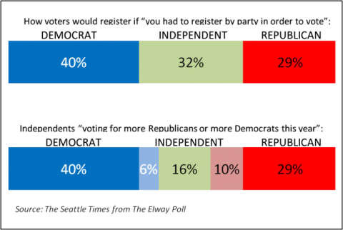
That’s a solid statement. But what struck me was that the commentary, based on the chart I’m reproducing here, might seem inconsistent with the reliability statement above.

Chart of Elway Research Poll Results from Seattle Times

The accompanying text reads “More Washingtonians claim allegiance to Democrats than to Republicans, but independents are tilting more towards the GOP.” How can this be, when the difference is only 4% (6% more Democrats, 10% more Republicans)? The answer lies in how statistical testing works and the fact that statistical tests take into account the differences arising from different event probabilities.

First, let’s dissect the reliability statement. It means that results from this survey will be within ±5% of the true population, registered voters in this case, 19 out of 20 times if samples of this size were drawn from the registered voter list and surveyed. (One time in 20 the results could be outside of that ±5% range; that’s the result of sampling.) This ±5% range is actually the worst case and is only this high at for 50% event probabilities – meaning the situation where responses are likely to be equally split. Researchers use the worst case figure to ensure that they sample enough people for the desired reliability whatever the results are. In this case, the range for Independents leaning towards Democrats is ±2.3% (i.e. 3.7% to 8.3%) while the range for Independents leaning towards the GOP is ±2.9% (i.e. 7.9% to 12.9%). But these ranges overlap so how can the statement about tilting more to the Republicans be made with confidence?

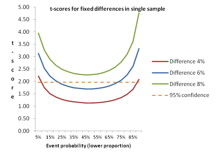
We need to run statistical tests to apply more rigor to the reporting. In this case t-tests or z-tests will show the answer we need. The t-test is perhaps more commonly used because if works with smaller sample sizes, although we have a large enough sample here for either. Applying a t-test to the 6% and 10% results we find that the t-score is 2.02 which is greater than the 1.96 needed for 95% confidence. The differences in proportions are NOT likely due to random chance, and the statement is correct.

Chart of t-scores for small proportion differences

To illustrate the impact of event probability on statistical testing, this diagram shows how smaller differences in proportions are more able to discriminate differences as the event probability gets further away from the midpoint. Note that even at 6% difference results between about 20% and 70% (for the lower proportion) won’t generate a statistically significant difference, while at 8% difference the event probability doesn’t matter. Actually, 7% is sufficient – just.

Without using statistical testing, you won’t be sure that the survey results you see for small differences really mean that the groups in the surveyed population differ. How can you prioritize your efforts for feature A versus feature B if you don’t know what’s really important? Do your prospects differ in how they find information or make decisions to buy? You can create more solid insights and recommendations if you test.

Tools for statistical testing

The diagram above shows how things work, and is a rule of thumb for one type of testing. But it is generally best to use one or more tools to do significance testing.
Online survey tools don’t generally offer significance testing. The vendors tell me that users can get into trouble, and they don’t want to provide support. So you are need to find your own solutions. If you are doing analysis in Excel you can use t-tests and z-tests that are included in the Data Analysis Toolpak. But these only work on the individual results so if you are trying to look at aggregate proportions (as might be needed when using secondary research as I did above) you need a different tool. Online calculators are available from a number of websites, or you might want to download a spreadsheet tool (or build your own from the formulae). These tools are great for a quick check for a few data points without having to enter a full data set.

SPSS has plenty of tests available, so if you are planning on doing more sophisticated analysis yourself, or if you have a resource you use for advanced analysis then you’ll have the capability available. But SPSS, besides being expensive, isn’t all that efficient for large numbers of tests. I use SPSS for regressions, cluster analysis and the like, but I prefer having a set of crosstabs to be able to quickly spot differences between groups in the target population. We still outsource some of this work to specialists, but have found that most of full-service engagements include so we recently added WinCross to our toolbag. We are also making the capability available for our clients who subcontract to 5 Circles Research.

WinCross is a desktop package from The Analytical Group offering easy import from SPSS or other data formats. Output is available in Excel format, or as an RTF file for those who like a printed document (like me). With the printed output you can get up to about 25 columns in a single set (usually enough, but sometimes two sets are needed), with statistical testing across multiple combinations of columns. Excel output can handle up to 255 columns. There are all sorts of features for changing the analysis base, subtotals and more, all accessible from the GUI or by editing the job file to speed things up. It’s not the only package out there, but we like it, and the great support.

Conclusion

I hope I’ve convinced you of the power of statistical testing, and given you a glimpse of some of the tools available. Contact us if you are interested in having us produce crosstabs for your data.

Idiosyncratically,
Mike Pritchard

Filed Under: Methodology, News, Published Studies, Statistics Tagged With: News, Published Studies, statistical testing, Statistics

3 Comments

Hyatt’s “random acts of generosity” – good idea or off target?

Sunday’s New York Times Magazine has an article about a new program being introduced by the Hyatt hotel chain intended to stimulate real loyalty in the form of future business through gratitude generated by generous acts such as having a bar tab waived randomly.

It isn’t totally clear how closely the new program is associated with the Hyatt’s Gold Passport loyalty program.  The Times article states that recipients don’t have to be members, but Mark Hoplamazian (Hyatt C.E.O) writes in a guest blog post for USA Today that the “random acts of generosity” program is being run by the Gold Passport team.

It is certainly clear that current loyalty programs are generally poor performers in terms of creating grateful customers whose relationship extends much beyond treating the loyalty card as a discount program. And I buy into the notion of gratitude as a powerful motivator.  But I’m not so sure that Hyatt’s plan will be able to walk the tightrope necessary to achieve their objectives.

  • The idea of randomness is troubling to me, in part because I wonder how well it will be applied in practice.  Will a customer receiving a free massage see the gift in a positive light, or be suspicious?  Will someone else who doesn’t receive a “random act of generosity” perceive unfairness?  In a planned paper on gratitude, the  importance of elements of randomness or discretion is mentioned.  Perhaps the giveaways will become merely discretionary, used as ways to appease an unhappy customer, or be perceived as such.
  • I’m also thinking of the random aspects of B.F. Skinner’s operant conditioning.  Is this what’s intended – to generate a feeling among customers that they should return because they might be the recipient of benefit next time (much like the dog who doesn’t know when they’ll receive a treat for good behavior).  If that’s the case, perhaps it would be better to be upfront with a truly randomized system.  That approach worked well for a funky burger joint in Portland, Oregon, where the possibility of a free meal was part of the schtick, but it could backfire for the Hyatt if customers simply see it as a different way to apply discounts (and perhaps would prefer lower prices).
  • Hyatt is in a bind on how to publicize the program.  On the one hand, if they promote the new program actively, they might be seen as doing this for very self-serving purposes.  Of course, that’s their intent, but they don’t want it to be obvious.  On the other hand, will word-of-mouth pay off quickly enough, or be accurate?
  • Perhaps a simpler approach would be instead to emphasize the aspects of service that don’t have as direct an impact on the consumer’s wallet.  The Times article mentions Zappos’ ability to generate gratitude by helping shoppers find a product that Zappos doesn’t have in stock.  Some of my most positive experiences of hotels, and the ones I’ll use for recommendations, are for places that go above and beyond to provide suggestions for local services, or advice for a future stay.  Perhaps Hyatt thinks that tactic has run its course?

For more information on research into the role of gratitude in relationship marketing, look for  “The Role of Customer Gratitude in Relationship Marketing“, by Robert W. Palmatier, Cheryl Burke Jarvis, Jennifer R. Beckhoff, & Frank R. Kardes, in the Journal of Marketing.

Hyatt’s goal should be to be seen as a chain that offers a better experience for all customers, not just the lucky few. Will the “random acts of generosity” program hit the mark?  It remains to be seen.

Idiosyncratically,
Mike Pritchard

Filed Under: News, Published Studies

Leave a Comment

comScore’s State of U.S. Online Retail Q1 2009

The recent comScore presentation on the State of Online Retail in the U.S. contained few surprises, but mainly confirmations together with some interesting perspectives.  For those unfamiliar with this material, comScore creates a quarterly report on Online Retail, combining survey results along with data from comScore’s behavioral panel.  The behavioral data covers many aspects of online behavior related to retail, including search, media exposure, and of course actual online transactions.  They also add in some other sources to give information about offline purchasing impacted by online activity.  Some of these results will eventually become available from the U.S. Department of Commerce, but comScore produces their reports several weeks in advance, and consistently close  (the Q4 figures use differing methodologies for gift card transactions, so the spread is wider).

Read the full report to draw your own conclusions (you can sign up here) but here are a few impressions:

Predictably, Q1 2009 saw the end of strong growth seen over the past several years.   I think the results are positive enough to be heartening for continuing success of online retail, although some of the growth probably comes at the expense of offline, as people are increasing the use of online to seek lower prices.

Online retail spending may have bottomed out, but it is unclear when it will start to grow again.  The current overall flatness is a result of a combination of factors for different groups. Lower income households (under $50K) show reduced spending over the same period last year, while higher incomes show some growth.  There is also distinction between age groups, with those under 44 increasing online spending and older consumers holding off.  Looks like younger people are less concerned because of longer time horizons or generally don’t want to defer spending any longer, while the older brackets are saving to rebuild their retirement assets instead of purchasing.  Depending on your perspective on the role of consumer purchasing in the U.S. economy and levels of saving, this is either a good thing or scary for the speed of the recovery.

Online prices, lower at the turn of the year through February, have now increased as inventories have been worked off, and promotional activity reduced to match.

Presumably reflecting the increased significance of comparison shopping and other money saving tools, the Internet has become more important to buying decisions than a year ago.  Three-quarters of consumers do online research before buying offline (I don’t know if this is an increase). And more people are using coupons than ever before, including from online sources.  No surprise, the role of the Internet as an integral part of shopping – both online and offline – is confirmed during tough economic times.  Regardless of whether the sale is completed offline, retailers must pay attention to providing useful information (not just discounts and sales, but also product information).   I was reminded of this recently buying a refrigerator from Sears. Maybe not the best use of time, but it was more efficient to do some preliminary research online, then discuss benefits with a sales person in the store.  In this case, we made the purchase in the store, then changed our minds after looking more thoroughly at home (and had to run the gamut of the Sears phone system to make the change – but that’s another story).  Next time, it will probably be better to do the final check after talking to the sales person with a laptop or smartphone.

comScore’s figures for incremental offline sales from search or display advertising (16% display only, 82% search only) might have you agreeing with the idea that search advertising is much more effective, but comScore points out that the reach is typically much higher for display, therefore the dollar lift may be higher for display.  In addition, the synergy for combined search and display (119% increase) is clear.  Cost effectiveness will vary with situation.

Enjoy the full report!

Idiosyncratically,
Mike Pritchard

Filed Under: Published Studies

Primary Sidebar

Follow us on LinkedIn Subscribe to Blog via RSS Subscribe to Blog via Email
Every conversation with Mike gave me new insight and useful marketing ideas. 5 Circles’s report was invaluable in deciding on the viability of our new product idea.
Greg HowePresidentCD ROM Library, Inc.
Mike brings a tremendous balance of theoretical marketing research with a strong practical knowledge of marketing. He can tailor the research to the right level for your project. I have hired Mike multiple times and he has delivered each time. I would hire him again.
Rick DenkerPresidentPacket Plus
Since becoming our contracted consultant for market research services in 2010, 5 Circles Research has revolutionized our annual survey of consumer opinion in Washington. Through the restructuring of survey methodology and the application of new analytical tools, they have provided insights that are both wider in their scope and deeper in their relevance for understanding consumer values and behavior. As a result, the survey has increased its significance as a planning and evaluation tool for our entire state agency. 5 Circles does great work!
Blair ThompsonDirector of Consumer CommunicationsWashington Dairy Products Commission
Many thanks to you for the very helpful presentation on pricing last night. I found it extremely useful and insightful. Well worth the drive down from Bellingham!
G.FarkasCEOTsuga Engineering
You know how your mechanic knows what’s wrong with your car when you just tell them what it sounds like over the phone? Well, my first conversation with Mike was like that — in like 10 seconds, he gave me an insight into my market research that was something I’d been struggling trying to figure out. A class like this will help you learn what you can do on your own. And, you’ll have a better idea of what a research vendor can do for you.
Roy LebanFounder and CTOPuzzazz
I hired Mike to develop, execute and report on a market research project involving a potential business opportunity. I was impressed with his ability to learn the industry and subsequently develop a framework for the market research project. He was able to execute the research and collect data efficiently and effectively. Throughout the project, he kept me abreast of the progress to allow for any adjustments as needed. The quality and quantitative output of the results exceeded my expectations and provided me with more confidence in the direction of the business opportunity.
Mike ClaudioVice President Marketing and Business DevelopmentWizard InternationalSeattle
Mike did multiple focus groups for me when I was at Amazon, and I was extremely pleased with the results. Not only is Mike an excellent facilitator, he also really understood the business problem and the customer experience challenges, and that got us to excellent and very actionable results.
Werner KoepfSenior ManagerAmazon.com
I have come to know both Mike and Stefan as creative, thoughtful, and very diligent research consultants. They were always willing to go further to make sure respondents remained engaged and any research results were applicable and of immediate use to us here at Bellevue CE. They were partners and thought leaders on the project. I am happy to recommend them to any public sector client.
Radhika Seshan, Ph.DRadhika Seshan, Ph.D, Executive Director of Programs Continuing Education Bellevue College
What we were doing was offering not just a new product, but a new market niche. We needed to understand traditional markets well to characterize the new one. Most valuable was 5 Circles ability to gather research data and synthesize it.
Will NeuhauserPresident Chorus Systems Inc.
Great workshop! You know this field cold, and it’s refreshing to see someone focused on research for entrepreneurs.
Maria RossOwnerRed Slice

Featured Posts

Dutch ovens: paying a lot more means better value

An article on Dutch ovens in the September/October 2018 of Cook’s Illustrated gives food for thought (pun intended) about the relationship of between price and value. Sometimes higher value for a buyer means paying a lot more money – good news for the seller too. Dutch ovens (also known as casseroles or cocottes) are multipurpose, [Read More]

Profiting from customer satisfaction and loyalty research

Business people generally believe that satisfying customers is a good thing, but they don’t necessarily understand the link between satisfaction and profits. [Read More]

Customer satisfaction: little things can make a big difference

Unfulfilled promises by the dealer and Toyota of America deepen customer satisfaction pothole. Toyota of America and my local dealer could learn a few simple lessons about vehicle and customer service. [Read More]

Are you pricing based on cost rather than value? Why?

At Pricing Gurus, we believe that value-based pricing allows companies to achieve higher profitability and a better competitive position. Some companies disagree with that perspective, or feel they are stuck with cost-based pricing. Let’s explore a few reasons why value-based pricing is generally superior. [Read More]

Recent Comments

  • Mike Pritchard on Van Westendorp pricing (the Price Sensitivity Meter)
  • Marshall on Van Westendorp pricing (the Price Sensitivity Meter)
  • 📕 E mail remains to be the most effective SaaS advertising channel; Chilly emails that work for B2B; Figuring out how it is best to worth… - hapidzfadli on Van Westendorp pricing (the Price Sensitivity Meter)
  • Isabelle Spohn on Methow Valley Ski Trails gets pricing right
  • Microsoft Excel Case Study: Van Westendorp-un "Price Sensitivity Meter" modeli | Zen of Analytics on Van Westendorp pricing (the Price Sensitivity Meter)

Categories

  • Overview
  • Contact
  • Website problems or comments
Copyright © 1995 - 2023, 5 Circles Research, All Rights Reserved